

Volume 46 - Autumn 2018
Customers Recent Bindings
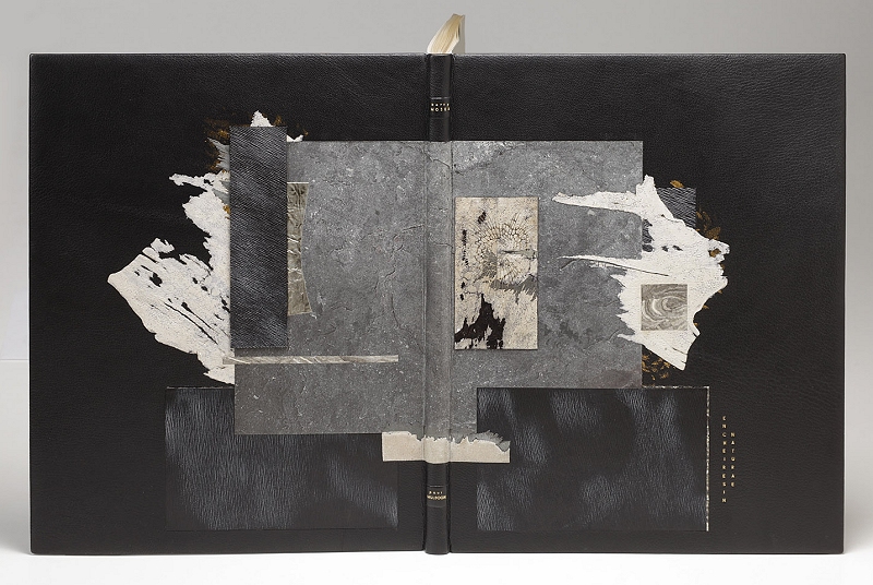
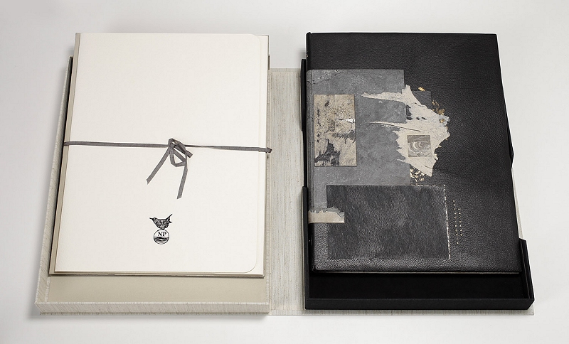
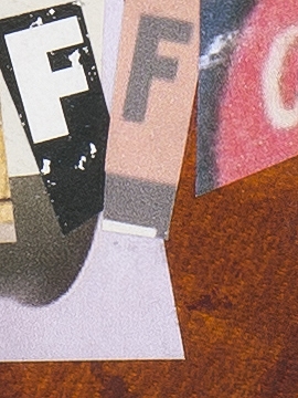
Bound by Coleen E Curry
Encheiresin Naturae by Paul Muldoon
Illustrations by Barry Moser
Published by Nawakum Press, 2015
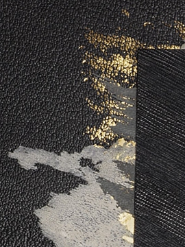
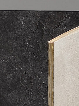
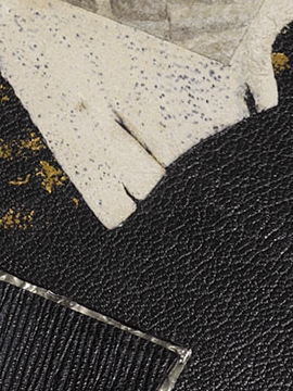
Full Chieftan leather binding sewn on 5 cords with boards laced-in. Rough edge gilding and silk embroidered headbands. Inlays of sanded embossed goat leather, and pewter. Onlays of slate stone leaf, leather splits, pewter and wasp's nest. Centerpiece inlay made of collaged leather splits, leather, pewter and dried section of Watsonia bulb. Gold leaf tooling and title. Unique leather split flyleaves and edge to edge slate stone leaf.
"Moser's work inspired me to create a bold design with elements of the earth with materials such as pewter, stone and plant. The geometrical shapes and tones introduce his prints."
Coleen Curry bound her first book in 2003 in Colorado and was hooked. She then became a student of Monique Lallier at the American Academy of Bookbinding (AAB) and graduated in 2009 with a diploma in Fine Binding. She has studied with Eleanore Ramsey, Dominic Riley and Hélène Jolis. Coleen teaches at AAB and is also an assistant to Don Glaister. She is a Board member of the San Francisco Center for the Book and a past President of the Hand Bookbinders of California. Coleen has exhibited internationally and her work is held in private collections. She is Canadian and lives in Muir Beach, CA with her husband, where she crafts design bindings, runs trails and rock climbs in her free time.
Coleen and her work can be found at Coleen Curry Fine Bookbinding
 |
 |
 |
Bound by Kari Tveite
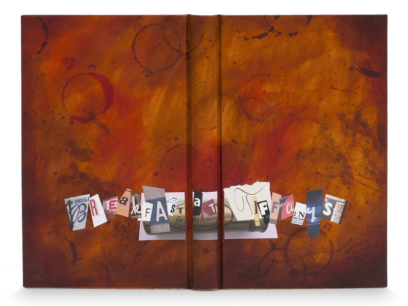
Breakfast at Tiffany's by Truman Capote
Introduction by Jay McInerney
Illustrations by Karen Klassen
Published by The Folio Society
This binding, was the winner of the J Hewit & Sons, Interesting Treatment of Leather prize in the Designer Bookbinders Competition 2014
"Without the writer, there would be no story, so to my mind this was of the utmost importance. I therefore decided that the cover of the book would be the writer's desk (or how I imagine it). The end papers would be cocktail menus (as there seems to be a lot of drinking). I embarked upon a considerable amount of research imagining the writer in his rented room sitting at an old, worn, shabby desk (that could probably tell a few stories of its own) - with layers of accumulated dirt and grime, and wear and tear. It would be stained with rings from glasses, splashes, splatters, spilt liquids and finger prints. There would be cigarette burns where he had put these down on the edge of the desk, to concentrate on his writing. (Statistically he would be right handed, so these are on the left side of the desk, as he would have been holding the cigarette in this hand).
The end papers were inspired by cocktail menus from the 1940s - with corresponding prices. These were also designed and hand-painted by Kari using acrylics, and the background echoed on the edge design. The lettering is a collage of individual letters on various ephemera mentioned in the text - as they would have appeared at the time. These include Picayune cigarettes, Tums lozenges, Sloane's Liniment and specific newspapers.
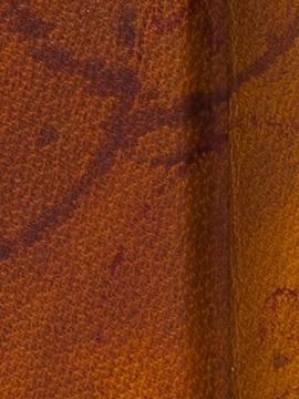
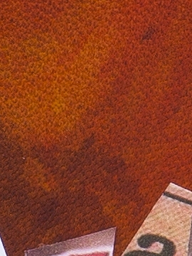
Materials - For the cover, i.e. the writer's desk, our Fair Goat was used. Leather dyes were applied using various brushes, cotton wool and sponges building up layers to get an aged effect. The base colour consists of six different pigments, some thinned with white spirit. Marks made by cocktail glasses were an important part of the design (and these also tie in with the end papers and edge decoration). Kari made these using different sizes of glasses dipped in leather dyes. It took some time, and a lot of practise runs to get the desired 'print'.
"The cigarette burns were a technical challenge. I found the leather puckered as the fibres shrunk, if it got too hot, - or a hole would appear. It did help however to PVA the leather onto the board first. Stubbing out the cigarettes on the leather, and singeing it with the lighter gave good results. All this, and I don't even smoke! After stippling and splashing, I finally poured on shellac (French polish) to mimic spillage. This resulted in beautiful, shiny pools of liquid - with an "edge" - which contrast beautifully with the more matt leather dyes."
Kari Tveite - "I am Norwegian and grew up not only in Europe, but also in Asia and Africa, and I have now been living in England for a very long time and am settled here. I've been an artist as long as I can remember, and consider myself a craft person / designer. I'm good with my hands. It is 16 years since I started painting bone china, to my own designs, in Bloomsbury - which is very therapeutic. I trained at Chelsea School of Art where I obtained a BA in Mural Design, MA in Stained Glass and then taught part time. (I have also studied millinary and upholstery). I worked for many years with paint finishes doing wood graining, marbelling and painting murals. Over the years I have painted / worked on a lot of different surfaces including walls (of all kinds), cars, caravans, glass, china, wood, cotton, organza, wool, plastics, plaster, metal (and the more obvious)."
"I had imagined that leather would be difficult to paint on and work with, but I have found it a surprisingly lovely medium. I will be working with it a lot more now! For the last four years I have been concentrating on bookbinding working in Studio 5 in Barnes. I am passionate about book arts, and hope to make a career of bookbinding. I have already started work on next year's competition book."
Kari can be contacted on karitveite@yahoo.co.uk
 |
 |
 |
Skin Deep - Volume 46 - Autumn 2018
Download Skin Deep - Volume 46 in PDF Format