

Volume 21 - Spring 2006
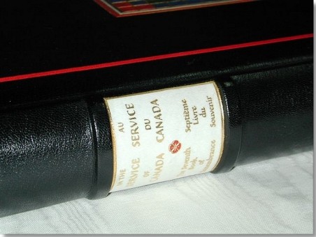
The Seventh Book of Remembrance
by Richard Smart
 The
Seventh Book of Remembrance records, by name, Canadian Service men and women
whose death is attributable to military service since 1947, with the exception
of those commemorated in the Korean War Book of Remembrance. This book, like
the other six books of remembrance, employs calligraphy, illumination, design
and text to provide recognition to those who died in service to our country.
The
Seventh Book of Remembrance records, by name, Canadian Service men and women
whose death is attributable to military service since 1947, with the exception
of those commemorated in the Korean War Book of Remembrance. This book, like
the other six books of remembrance, employs calligraphy, illumination, design
and text to provide recognition to those who died in service to our country.
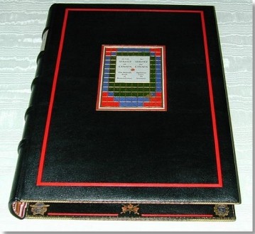
The book is organized by year, starting from 1947. Each year appears on a new page, as a heading inscribed in gold. Each page is decorated at the top and outside edges with a three line border in the symbolic theme colours of red, blue, or green with gold. On most openings, there appears a full colour rendering of one of Canada's military badges. The pre 1968 Navy, Army and Air force badges are printed in rotation on those years' pages and the Canadian Forces badge appears from 1968 onwards. There are 10 names inscribed on each page, or seven names if the pages contain a badge or other decoration. Each entry contains the individual's rank and unit along with their names, decoration and date of death.
The book has a number of themes running throughout, the most predominant being the colours chosen. Red signifies the blood of the Canadian sacrifice, Blue represents the skies and waters that surround Canada, and the Green represents the lush fields and forest. These colours are incorporated into the main theme of the illumination and binding - the patchwork quilt. This can be seen on both the title page and on the front cover, and elements of patchwork are woven throughout the text. This pattern symbolizes the order, organization and precision that one associates with the military. Additionally, in its resemblance to a quilt, the grid provides a visual symbol of the warmth of the homes from which the men and women commemorated came. The falling maple leaf moves through green to red, or from life to death and with by its dying, nourishes our soil to produce a new generation of brave Canadians.
 The
Challenges:
The
Challenges:
- 1. The book had to be bound so it would open and lay almost flat. Previous books, for example the First and Second World War books bound by Cockrells had tight backs and therefore opened nice and flat. My design incorporated raised bands on a hollow back with cushion boards "domed not beveled". However it was still constructed to open flat.
- 2. Although the book was being stored in the 'open' position, where the spine and cover would not be seen, it still needed to be traditional binding with a full gilt spine and decorative cover. Also, a large proportion of the decoration had to be on the inside.
- 3. Time - As the binder, I had less than five weeks to turn sheets of vellum into a masterpiece.
My design was to create a border out of the binding to frame the very important vellum pages containing the names of those who lost their lives. As the book represented all three Forces I decided to use the Forces insignia's as part of my tooling. This tied in nicely with the insignias used throughout the book by the Illuminator.
The Project Starts...
The large vellum sheets were hand delivered to me in Vancouver by the Calligrapher from Ottawa.
 Week
1 - Preparing the Vellum for Binding
Week
1 - Preparing the Vellum for Binding
 I
carefully trimmed by hand the head of each sheet to give a square edge to work
from. Next I folded each page to the head and a pre-marked centre on the sheet,
to form a four-page section. Once the pages were folded I trimmed the fore edges
of each section. After all pages were folded and trimmed they were ready to
mark up for sewing. To help create strength in the spine and importantly to
create a spine that was going to stay in shape, I decided to sew it on five
vellum strips. The vellum strips were 1" (25mm) wide and were double thickness.
I
carefully trimmed by hand the head of each sheet to give a square edge to work
from. Next I folded each page to the head and a pre-marked centre on the sheet,
to form a four-page section. Once the pages were folded I trimmed the fore edges
of each section. After all pages were folded and trimmed they were ready to
mark up for sewing. To help create strength in the spine and importantly to
create a spine that was going to stay in shape, I decided to sew it on five
vellum strips. The vellum strips were 1" (25mm) wide and were double thickness.
The end sheets were made of white moiré silk with the silk cut over-size by Ľ" (7mm) all round. Then the edges were folded in and ironed to crease the silk at the edges. The turn-ins were then glued and tipped on to folded and trimmed vellum with a leather joint, making up the front and rear end sheets.
After sewing, the book was put in to shape with a nice round to the spine, placed in a laying press and lined up between the strips with linen and acid-free mould-made paper. Leaving the book in place to dry overnight and take shape, I used the opportunity to make up the spine liner.
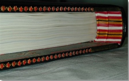
I chose to have a triple headband on the book to give a little more depth and integrity to the spine and the exceptionally large squares I had chosen for the binding design. The headbanding material was made up of two pieces of vellum, laminated to make up the first and second part of the headband. Cord was used for the final bead. The first piece of vellum was the same depth as the square of the book, the second about Ľ" (7mm) less.
Week 2 - Binding the book
 Once
the book was removed from the press I started to make up the boards. I did this
by laminating three thicknesses of millboard and hand shaping them to the desired
shape.
Once
the book was removed from the press I started to make up the boards. I did this
by laminating three thicknesses of millboard and hand shaping them to the desired
shape.
The next step was to line the inside of the spine piece with linen and paper. 1mm millboard was cut to match up with the cover size. This was glued one side at a time, sticking the vellum strips down, then the lined spine liner and then finally the shaped board, leaving a 0.25" (7mm) groove between spine liner and the board. This created the same effect as a split board (typical of an account book style binding) but with a little more control, as required for such a large book. The book was then placed back into the press to dry and settle.
As the book measured 20" (510mm) x 14.5" (370mm), it was necessary to join skins to cover the book. The book was being bound in black Morocco, with raised bands in place on the spine liner. First though I had to pare two skins and mark out where the join was going to be. Careful consideration was taken to ensure the join was in a discreet location. I then covered the boards and turned in the leather. The leather joints were laid down at the same time. The whole binding was paste washed and allowed to dry.
 Week
3 - The cover - onlays
Week
3 - The cover - onlays
Next I started marking out the front and back cover for the onlays. I paired the leather for the onlays and mounted the different coloured leathers on very fine tissue paper. This was done to prevent the leather stretching whilst cutting it to the desired shapes. I then pasted-out the red pinstripe piece of leather which was laid on to the marked out area, bevelling the join in the corners, making it as neat and invisible as possible.
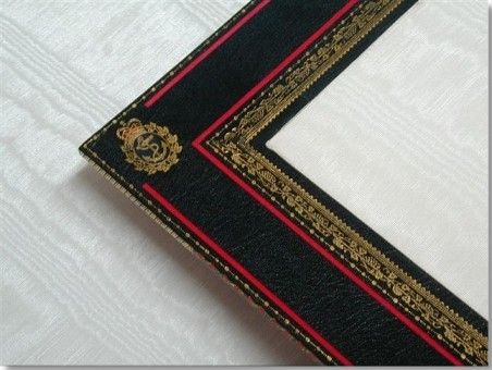
With the front cover design, I had decided to do a simple red border on the outside of the cover and having been inspired by the calligrapher's words on her design on the title page (the patchwork blanket design as mentioned earlier), I reproduced an exact replica from leather onlays on the front board of the book.
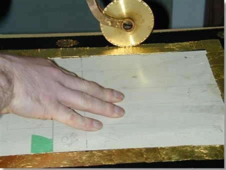
In order to create this design I took a copy of the title page and separated it into three. The first part being the centre piece with the lettering and a border, the second was all the lines from the outside of the lettering that are in gold to the outside of the design and the third part the diagonal blind lines which gave the design its depth and texture. These three different sections were then sent to the engravers for engraved blocks to be made. I used the second block first. It was placed exactly where the design was to go and using my blocking machine I made a light pull to give me the outline of the design. Next was the arduous task of paring the leather for the onlays. It had to be pared to the point where I could see through the leather when held up to the light. The leather was then cut to the correct shape to match up the title page design. For the centrepiece with the lettering, as it needed to be white, I used vellum. I used a piece cut from the page trimmings. Once all the pieces were in place I was ready to block the gold into the design. To make certain everything was correctly lined-up, I set the machine up by putting the book in place with a piece of Mylar covering the design, then using foil I blocked on to the Mylar which gave me the ability to line up the book and block in exactly the right place. I then placed 24 carat gold leaf on the design and blocked in the gold. I used the same method to line up the block with the blind lines and again once the positioning was correct I then made a pull to put in the blind lines on the design. Any lines that did not go in clean due to any different thicknesses between the areas with onlays on areas without got filled in after by hand with a pallet or roll. This section was now complete, it was masked off with tape and blotting paper to protect it whilst the inside work was done.
 Week
4 - The Inside - Gold, Gold and more Gold
Week
4 - The Inside - Gold, Gold and more Gold
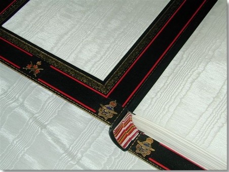
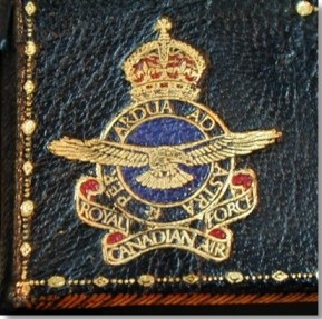
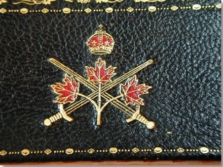
The majority of the gilding was to take place inside the book on the turn-ins where I intended to make the most of the extraordinary large square on the boards. Firstly I marked off where the insignia tooling was to go and put each tool in blind. Once the blind layout was complete, I cut out the individual pieces of leather for the onlays. In order to get the tiny pieces of leather placed exactly right, I heated each tool and blind stamped them on to each piece of coloured leather using the relevant colours for each individual insignia. I then cut out the pieces out carefully.Once all the colours were in place they were left to dry before giving them a paste-wash to remove any excess dry paste and seal the joins and grain. It was then allowed to dry again before the area was glaired twice with BS Glaire. Once each insignia had been glaired, the gold was laid on and the tool was applied. I then used a gold rubber to remove the excess gold. The same process was applied to all fourteen tooled insignia, seven (The Army, Navy and Air force under the reign of King George VI, the Army, Navy and Air force under the reign of Queen Elizabeth II and the combined armed forces) inside the front cover and the same seven mirrored inside the back cover.
Once all the insignia were tooled I then cut and laid the red strips creating a box design between the tooling.
The next step was to roll the design bordering the silk doublure whose design was made up of a number of different finishing rolls. One of the roll designs I chose to use in this border was the grape vine, for two reasons. The grapevine was used as a border decoration by the illuminator in the books of the First and Second World War, and on my visit to the parliament buildings in Ottawa I admired a horizontal grape vine design around the wood panelling in the house of Senate and thought it appropriate to include in the design.
 In
order to ascertain the widths of each tool and thus the correct placement of
each I did one side in blind. Next gold was laid on, to cover the whole area
being tooled. Marking the start point on each roll as I used them, I tooled
in the first roll then worked my way through the pattern running one roll along
side the next until they were all in, again removing all excess gold with the
gold rubber. I find a gold rubber the most effective way of getting the excess
gold out of the grain on goatskin. Using Vaseline then lighter fluid as I would
on calf, actually drives the gold deeper in to the grain leaving it impossible
to remove. With calf I tend to use a gold rubber initially then a grease or
oil rag and then lighter fluid.
In
order to ascertain the widths of each tool and thus the correct placement of
each I did one side in blind. Next gold was laid on, to cover the whole area
being tooled. Marking the start point on each roll as I used them, I tooled
in the first roll then worked my way through the pattern running one roll along
side the next until they were all in, again removing all excess gold with the
gold rubber. I find a gold rubber the most effective way of getting the excess
gold out of the grain on goatskin. Using Vaseline then lighter fluid as I would
on calf, actually drives the gold deeper in to the grain leaving it impossible
to remove. With calf I tend to use a gold rubber initially then a grease or
oil rag and then lighter fluid.
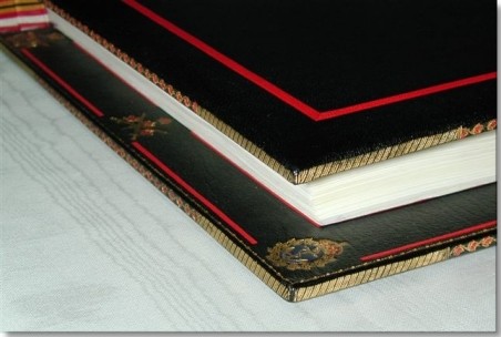
The final and most ambitious tooling that had to be done were the edges; keeping in mind the edge was just under Ľ " thick. I had a specific roll cut by P&S Engraving with a continuous pattern of maple leafs (the ultimate symbolic representation of Canada) entwined with a simple vine. Using the same method described earlier, I put the roll in blind having marked the starting place on the roll, this gave me an outline of where to place each red leaf. Next the incredibly tedious task of preparing the red leather leaves. I found on the lighter coloured leathers it worked well to run the tool over carbon paper before tooling the red as to really pronounce each leaf which made cutting them out a lot easier. I cut out nearly 400 leaves wondering halfway through why I had thought that this was a such good idea in the first place!
Once all 400 leaves were cut out I pasted them in to place on the edges, and then ran the gold over the pattern. As I did this, the leaves just came to life and I realized the effort had been worth it. It looked incredible. The finishing was complete. Over 30 hours of work had gone into the onlays and gold finishing.
 The
silk doublures were made by cutting acid free card to the size required to fill
in on the board and then the moiré silk was cut with a Ľ" border. Next the card
was placed loose on the silk and the edges of the silk were pasted and turned
in creating a softer looking doublure.
The
silk doublures were made by cutting acid free card to the size required to fill
in on the board and then the moiré silk was cut with a Ľ" border. Next the card
was placed loose on the silk and the edges of the silk were pasted and turned
in creating a softer looking doublure.
Week 5 - The book goes Home
Finally everything was properly cleaned up and a very thin coat of shellac was applied to the whole binding inside and out. At this point the wrapping was taken off of the text block and the book was opened. Once open the book laid flat with the spine moving away for the back off the book nicely, and much to my pleasant surprise I noticed the headbands, instead of sticking straight out inline with the spine fell straightened out and moved back against the spine covering the gap between the back of the text and the spine of the cover. It was just as though the headband was showing itself off. At that very moment, the whole book came together with a beautiful black gilt and red border framing such great artistry and calligraphy on stark white vellum.
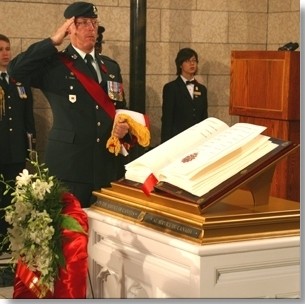
Upon its completion the book was hand delivered to the Peace Tower in Ottawa where it resides alongside the other six books. It is displayed in a purpose built glass case. Each morning at 11am one page of each of the books is turned, thus throughout the years each of the commemorated men and women have their name displayed for the public to see and remember.
Richard Smart - Richard has over twelve years experience working along side his father John in England. He has developed skills in the restoration and conservation of paper and documents and the undertaking of new & fine bindings. Richard now lives in Vancouver, Canada where he runs his own business, The Old English Bindery.
Skin Deep - Volume 21 - Spring 2006
Download Skin Deep - Volume 21 in PDF Format