

Volume 53 - Spring 2022
Project Shahnama
The Binding of the National Poem of Iran by Nicky Oliver
In 2018, one of my clients emailed me to ask if I could replicate an image onto leather for a fine binding.
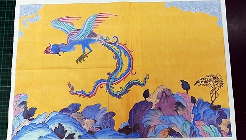
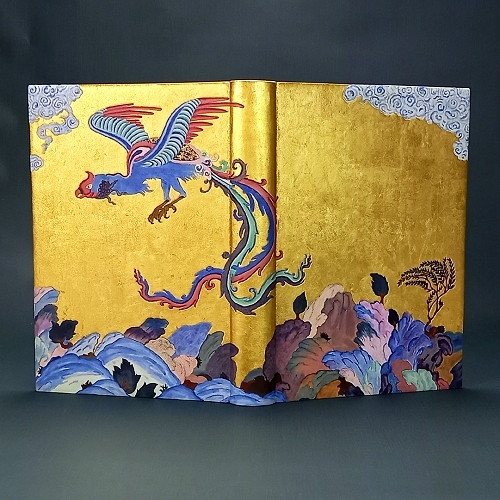
I was presented with these two images of a Simurgh.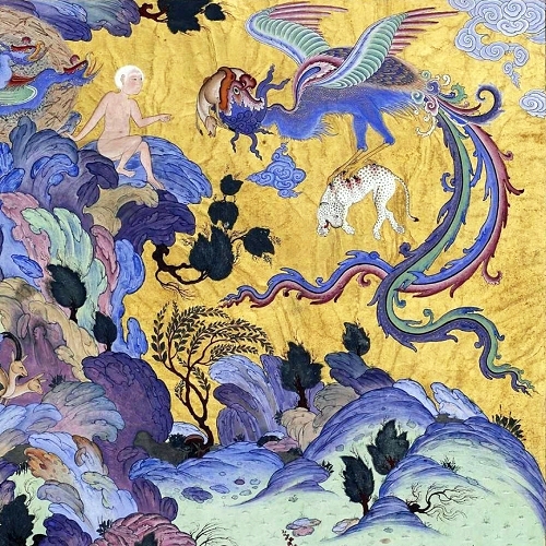
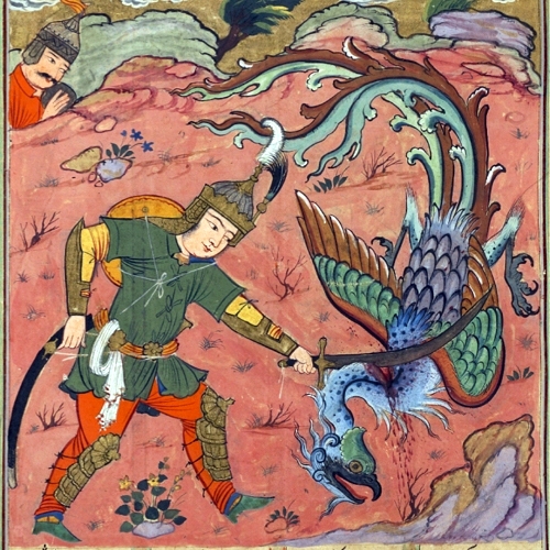
The Simurgh is 'a benevolent mythical bird in Persian mythology and literature.' My client loved the Simurgh in the first image but certain elements needed to be changed like the head and the feet for example, these were to be replaced with the details from the second image. He also wanted to simplify the background.
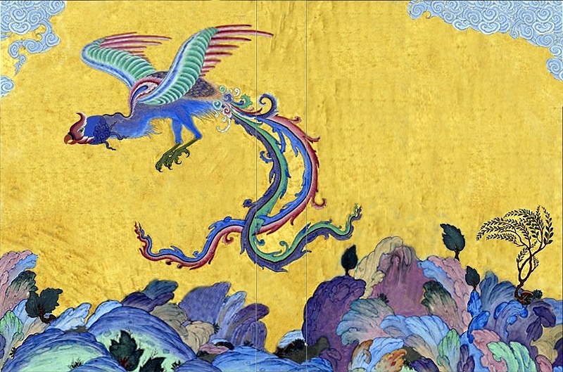
I employed Kim Southam (a designer and a wizard with a computer), to help with this task. After several edits, over a long period of time, the design was finally agreed upon. And so began the binding of The Shahnama.
What is The Shahnama?
I asked my client to pen a description and to include why he chose this design:
'The Shahnama is the national poem of Iran written in the 10th century. Part myth, part history, part epic, part romance and part tragedy, it tells the story of Iran up to the Arab conquest of the 7th century.
This printed version was commissioned by a group of Zoroastrian Iranians in the 19th century.
The central figure in the design is the Simurgh - a mythical bird - which personifies wisdom, healing and the protection of nature. I wanted the design not only to convey the magic of Iran but also to convey the beauty of the nature: the golden light in Iran, the mountains and the forests as well as pay homage to the artistry of past Persian miniaturists such as those who worked on the Shahnama of Shah Tamasp.'
Prior to my involvement with this project, the text block underwent a fair amount of conservation work. Pages were repaired, rebuilt and sewn ready for binding. This was undertaken by the very talented Sayaka Fukuda.
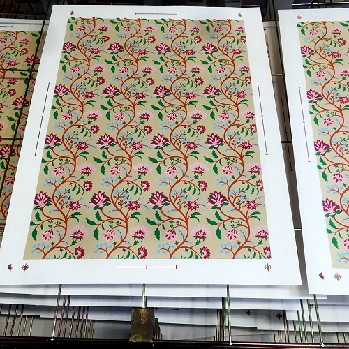
Once this was complete and the book was in my care, the endpapers had to be designed and made. The design is a combination of typical Persian floral patterns, some of which appear within the text block. The final pattern and colour combination were created by Kim. The colours chosen were influenced by the cover design. The design was then sent to Nick Gordon - a brilliant printmaker in Stromness, Orkney. He screen-printed several copies on 2 different weights of paper; one for the flyleaves and one for the doublures.
These beautifully screen printed sheets were also used for the cover of an additional A3 pamphlet binding which was part of the project.
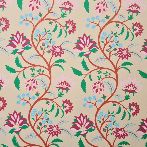
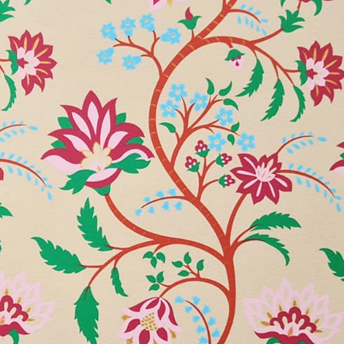
As soon as I received them the endpapers were made. I used the lighter weight screen-print for the flyleaves, which would have the leather joints inserted after binding was complete and the heavier weight screen-prints for the doublures.
Once the flyleaves were sewn on, I was able to gild the edges. I used 22crt real gold foil from Maison Alivon and The Claymore gilding roller.
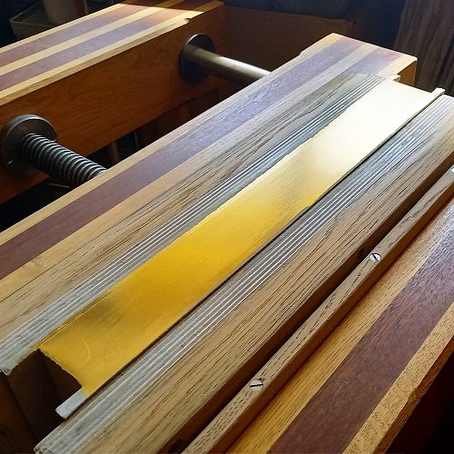
details www.maison-alivon.com and www.edgegilding.co.uk
Forwarding could commence...
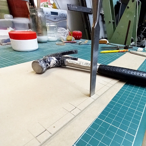
Rounding and backing |
 |
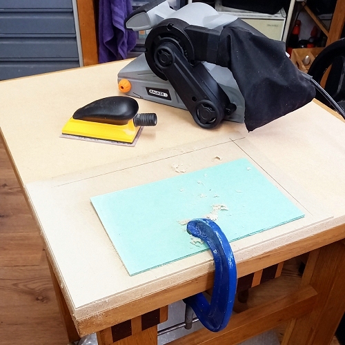 |
Board construction - several layers laminated together and sanded using a belt sander and Abranet. |
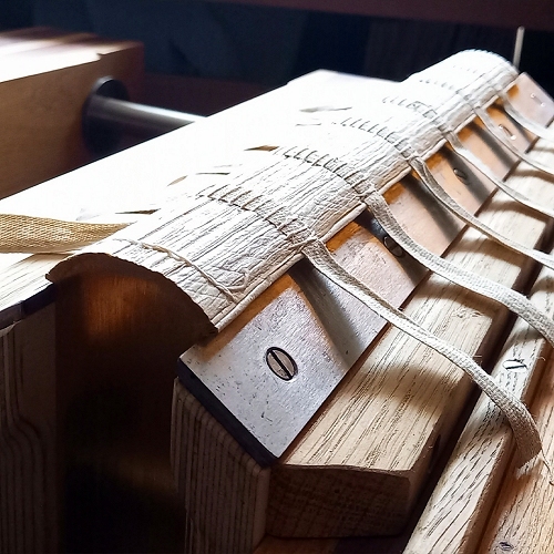
Once the boards were shaped, I could measure up and pierce the boards for lacing the tapes. |
 |
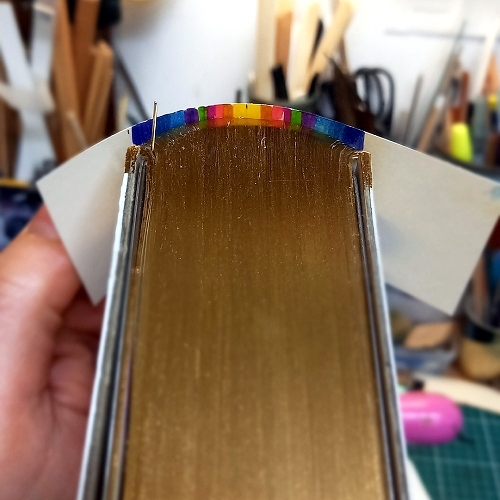
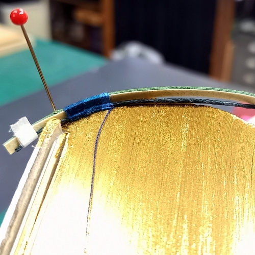
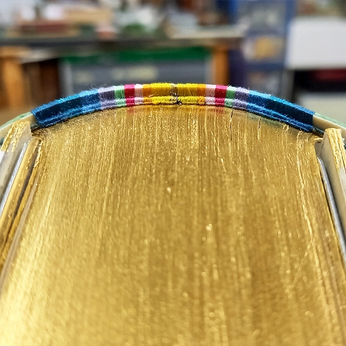
Before sewing the French double endbands, I created a template using Sharpie pens so that I could get an idea of positioning the colours. I had ten colours, a mixture of silk and polyester.
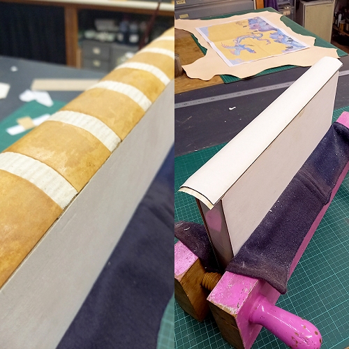
Spine linings and hollow
The text block measures approx 370 x 260 x 50mm. Although not particularly huge, it is incredibly dense and heavy. Handling was quite challenging.
Once the forwarding was complete... the fun stuff could begin!
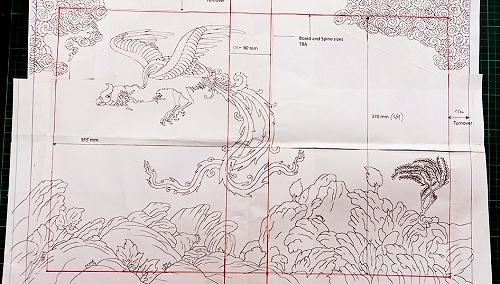
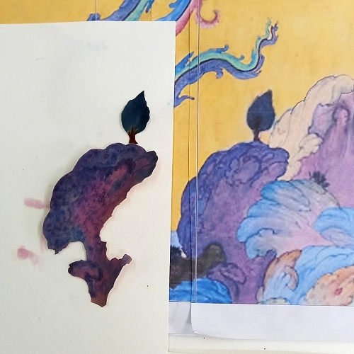
Kim supplied me with these two A2 sized photocopies of the designs: one for colour reference and the linear one to assist me with the onlay shapes. Both of these were to size and incredibly helpful.
Preparation!
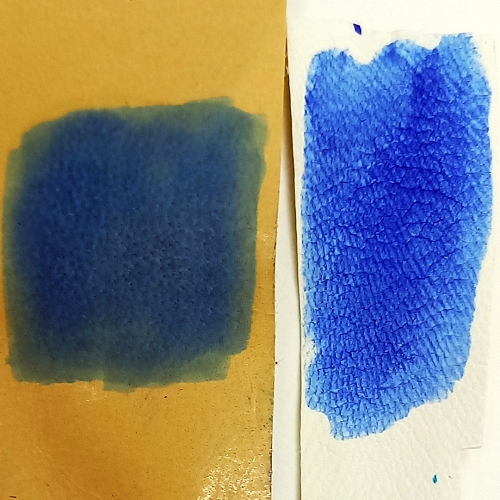
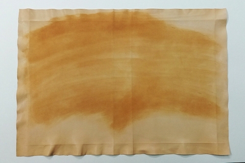
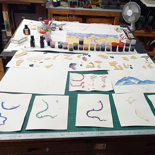
Before any leather preparation, especially when working on a project this intense, I like to prepare my palette. Dyes are chosen, mixed, tested and documented.
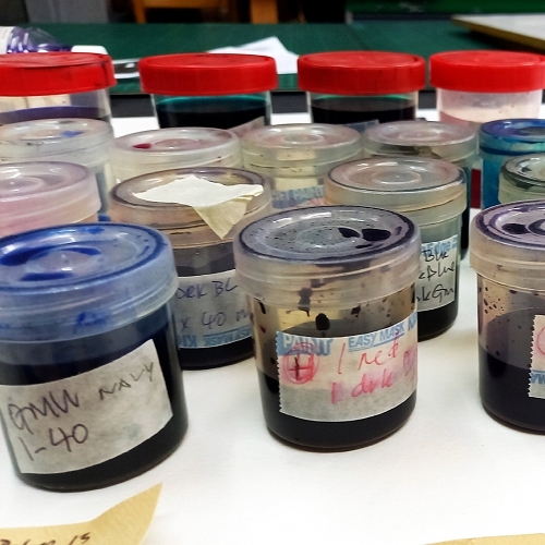
I also tested the dye on different leathers, the results are quite different. This gave me an idea of what leathers to use for the onlay pieces.
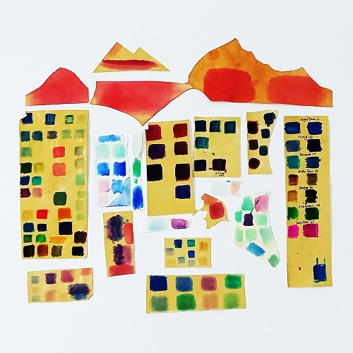
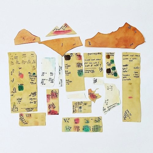
More preparation!
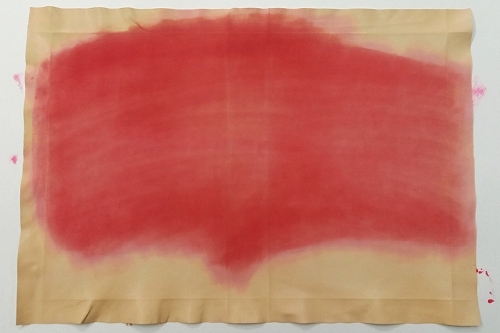
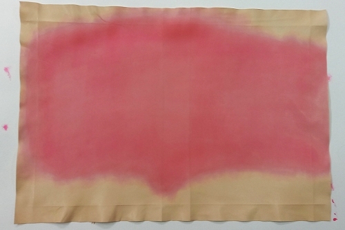
After I had settled upon the selection of dyes that were to be used, I needed to conduct further experiments.
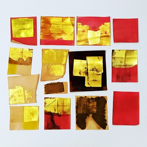
The background of my client's design is gold, which is textured, not smooth or overly 'bling'. I needed to figure out how to achieve this without it looking messy and I also needed to figure out how it would cope around the joint area and turn-ins. Cue more samples and stress tests.
I decided that I needed to dye the leather first and chose a warm but light pinky-red to off-set the cool blues of a lot of the onlay pieces. This was preferable to having bits of nude/fair skin peeping through the gold. I experimented with various adhesives, foils, glaire and gold leaf. Each sample piece was then creased, folded, sanded, hammered and, quite frankly, abused...
The covering leather (a beautiful flat grain goat from J Hewit & Sons Ltd.), all pared up and ready for some action.
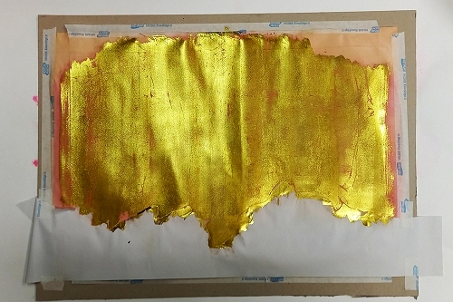
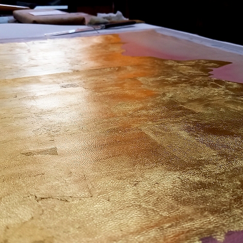
Layers and layers of gold, lots of gold! I used 23.5ct leaf from Wrights of Lymm Ltd. - approximately 60 odd sheets were used. Some leaves were applied flat, some slightly crumpled, to create a textured background. The 'under-layers', the sanded gold foil and coral red dye, peeped through in places. I loved the overall effect this created, there was movement and a vibrancy. I was very happy with the end result.
Onlays - Cutting & Dyeing.
It was difficult to choose which images to showcase here as there are over 100 onlay pieces on this binding - but here are a couple of snippets from the process.
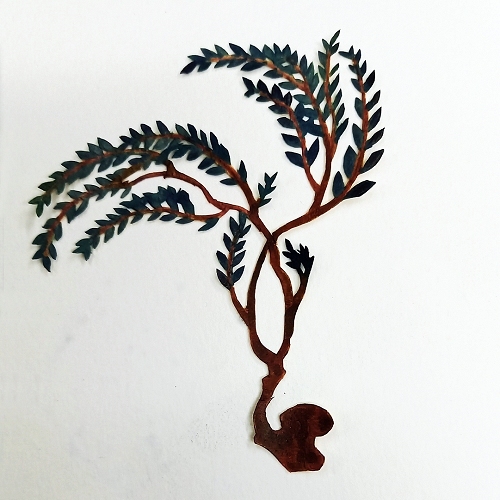
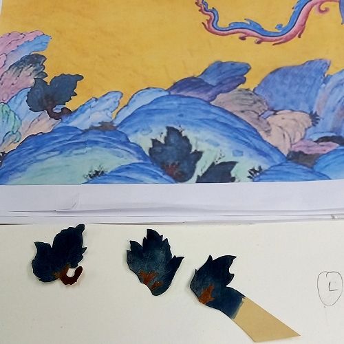
All pieces were cut from a variety of leathers: fair goat, fair calf, fair skiver and alum tawed goat, all from J Hewit & Sons Ltd. I had panels of each skin split at leatherthinning.co.uk down to 0.3mm thick. I try to be as methodical as possible, cut first then dye. This can be tricky since leather this thin can shrink after dye applications and each of the hundred plus pieces needed several layers. I find it is better to have a diluted solution and build up the colours slowly. It wasn't just the colour I had to match but also the texture and shading/movement.
When one is trying to match an image, in colour and texture, from paper onto leather, it'll never be exact but it is a delicious challenge to at least try.
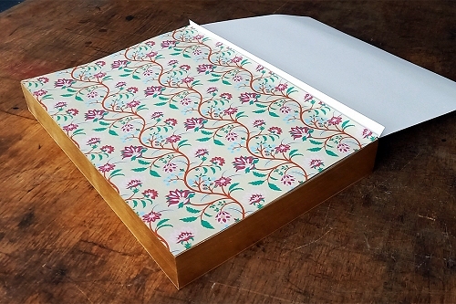
Once completed a box was needed, this was a real head scratcher. It needed to house the binding plus a A3 half leather pamphlet binding as well as the excess screen prints. I had to create a small model to figure out how best to cover it, so I made a soft envelope portfolio for the pamphlet binding and the screen prints. Each had a ribbon pull.
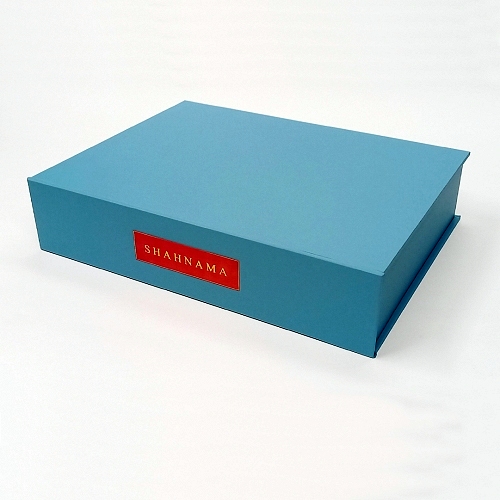
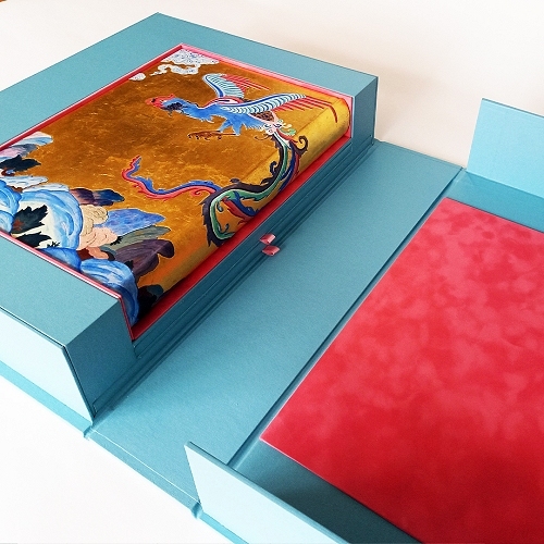
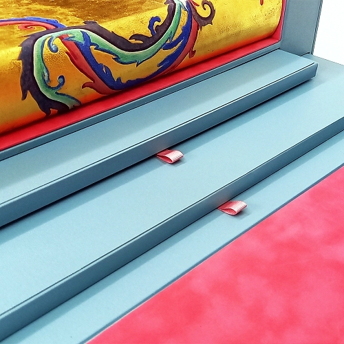
The prints were a lot larger than the binding and dictated the size of the box. The spine of the box had a recessed area which housed the hand dyed leather label. The lining is a combination of coral and baby pink suede.
This project has been such a joy and challenge. One that has offered new things to learn - which is one of the reasons I love bookbinding. It was a daunting task to take on a client's design and to state that I could reproduce it. It isn't exact, but I got it as close as I could. I'm pleased with it and most importantly, so was the client.

Nicky Oliver's education began in surface design and illustration and progressed to bookbinding where she felt she could combine her creative techniques with a craft that she loves. She has over 15 years experience working in commercial binderies where she honed a range of skills that include bookbinding, box-making, labels and blocking, inlay and onlay work, full leather and small-run limited edition bindings. Nicky specialises in the dyeing of her own leather for her design pieces, this aspect of her practice has enabled her to collaborate with other craftspeople. She welcomes the unity of different disciplines to create unique pieces of work.
Her company, Black Fox Bindery also plays host to various bookbinding workshops from beginner taster classes to advanced decorative techniques. These workshops are either taught by her or a guest tutor. Keeping the craft of bookbinding alive is of great importance and the primary reason why Black Fox Bindery was established.
Nicky can be contacted at Black Fox Bindery, London
www.blackfoxbindery.com
nicky@blackfoxbindery.com
Skin Deep - Volume 53 - Spring 2022
Download Skin Deep - Volume 53 in PDF Format