

Volume 56 - Autumn 2023
Customers Recent Bindings
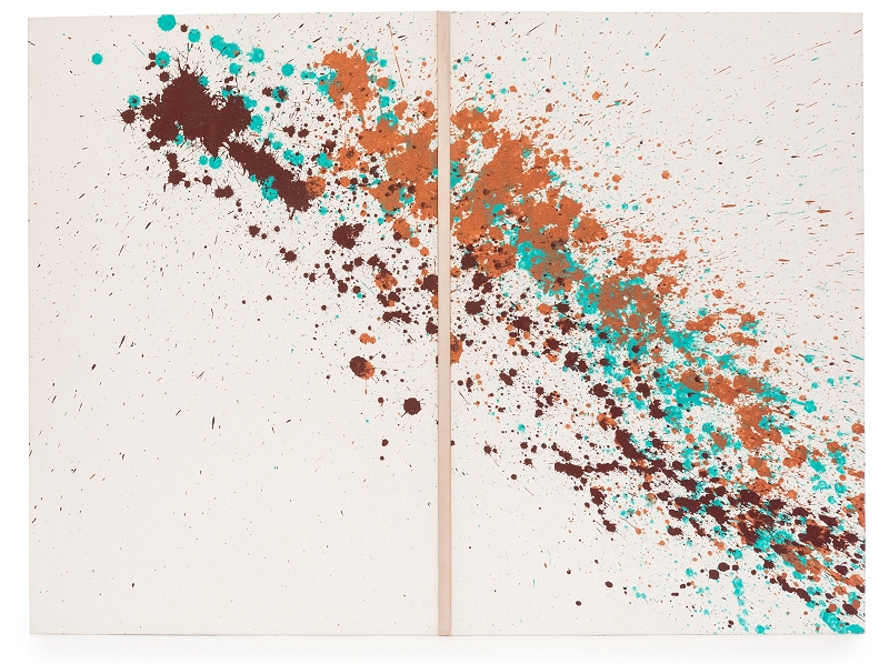
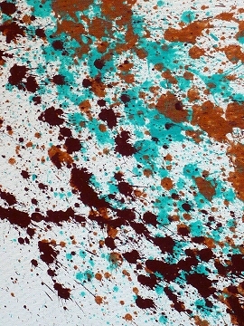
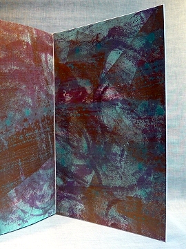
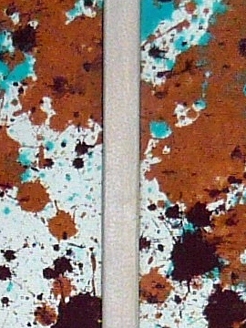
Bound by Kaitlin Barber
In Venice
Author: Alan Stein
Illustrator: Alan Stein
Publisher: The Church Street Press 2007
Kaitlin's binding of In Venice was awarded the 'The Antiquarian Booksellers' Association's Highly Commended Certificate'
in the Designer Bookbinders Bookbinding Competition 2017.
Book bound at Studio 5 in England. Three phase disappearing spine ultra flat back binding. Unsupported link stitch secondary sewn, full linen board attachment and skirting, ¾ hollow. Canvas with toned fair goat spine from J Hewit and Sons and mixed media. Mono printed leather jointed endpapers, edge-to-edge doublures. The design is a response to quote by Ruskin "throwing a pot of paint in the publics face". The text questions how to assess the value of artistic knowledge and experience and ultimately the place of realism versus conceptual art in our society.
Kaitlin Barber is a bookbinder and book artist from Toronto Canada. She has a deep appreciation for the all-encompassing nature of the art of the hand-made book. The artist is in total control of every aspect of the work creating interplay between concept, text, and image. Cover design, hand printed endpapers, and content come together forming a narrative, influenced by the text, but going far beyond. Kaitlin is a recent graduate of the two-year bookbinding program at The North Bennet Street School in Boston, Massachusetts. In 2016 she traveled to London to study contemporary design binding at Studio 5 with internationally recognized and exhibited Mark Cockram. During this time she bound submissions to the International and UK Designer Bookbinder competitions. Studying with Mark has opened Kaitlins eyes to the immense variety of ways in which colour, texture, and materials can be used to achieve flow throughout the work, creating a rich experience that is both visual and tactile.
Kaitlin can be contacted at Katiebarber21@gmail.com and her work can be found at kaitlinbarberbooks.blogspot.ca
 |
 |
 |
Bound by Richard Beadsmoore
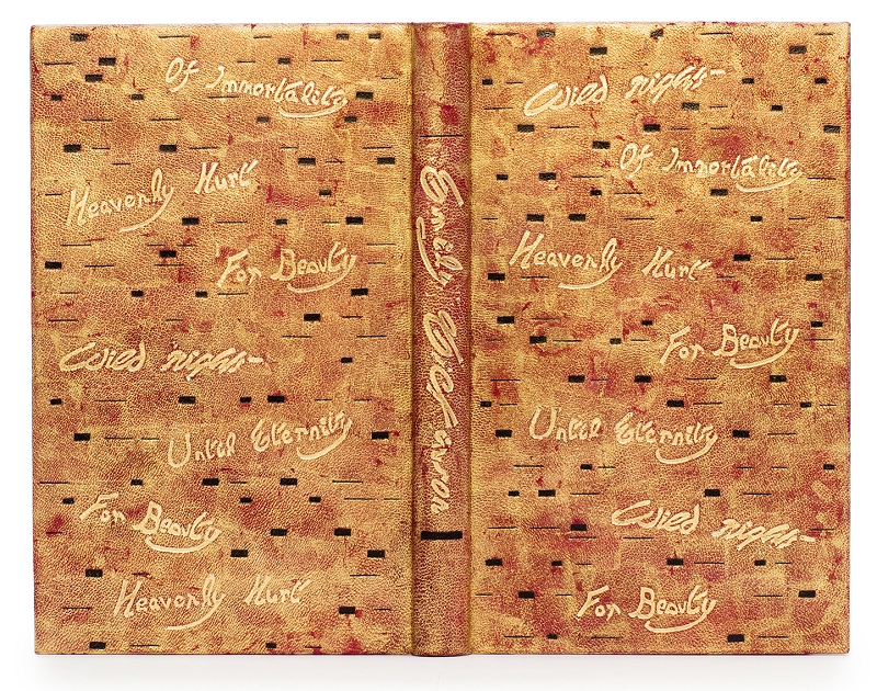
Selected Poems by Emily Dickinson
Introduced by Lavinia Greenlaw
Illustrated by Jane Lydbury
Published by the Folio Society
Bound in 2017
Richard was awarded the 'Ash Rare Books Lettering Award' in the Designer Bookbinders Bookbinding Competition 2017.
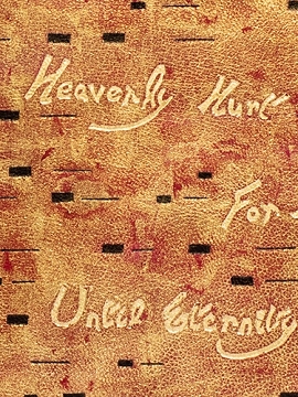
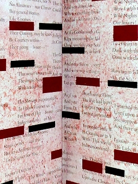
"I think there are basically two ways to approach the design for a book of poetry it, one being to treat the collection in its totality, either the prevailing mood and structure of the verse or the life and character of the poet. The other route is to choose a particular poem and use that as your inspiration. Initially I was thinking about the latter approach with the poem "Wild Nights", however as soon as you open a book of Emily Dickinson's poetry one of the first things that strikes you is her liberal use of dashes which she uses to emphasize, indicate a missing word, or to replace a comma or full stop.
With this in mind I decided to use the dash as the basis of the endpaper design. I initially printed a background texture (photograph of a section of wall at Pompeii) and then added a collage of her poetry. On top of that I added rectangles of Japanese paper of various sizes to represent the words and hyphens. Once they were stuck down I sanded the back of the paper to reduce their prominence (rather like back-paring a leather onlay).
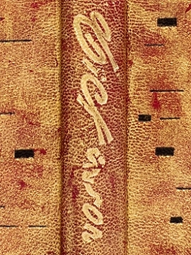
During my research I had already come across Emily's signature in her very distinctive handwriting and had decided to use it as my title on the spine and I then decided to reject the "Wild Nights" element and instead use pertinent words from her verse as the main part of the design.
To get the shade of red I wanted for the base colour I used a piece of Hewit's fair goat that I dyed with two shades of spirit dye. I then made lino-cuts of the words I was going to use. The title was impressed into the leather before covering but the rest were done on the covered book - scary! The whole of the book was then covered in 22 carat gold leaf which when dry was sanded off in order to get the right balance between the gold and the red.
Initially that was going to be the binding finished but on reflection I felt it needed an element of formality adding, which was when I went back to the endpaper design and decided to add the impressed black line work."
Richard was elected a Licentiate of Designer Bookbinders in 2015 and is currently studying at Studio 5 with Mark Cockram.
You can see more of Richard's work on his website www.beadybookbinder.com
 |
 |
 |
Skin Deep - Volume 56 - Autumn 2023
Download Skin Deep - Volume 56 in PDF Format