

Volume 50 - Autumn 2020
Lines
Tintern Abbey - by Hannah Brown
I am pleased to announce the completion of my most recent binding, a copy of 'Lines: Composed a few miles above Tintern Abbey, on revisiting the Banks of the Wye during a tour: July 13th 1798', or, in short, 'Lines'. The book is a 2002 publication by The Old Stile Press of a poem written by William Wordsworth which is often abbreviated to, 'Tintern Abbey' although the building doesn't actually appear within the poem. It was written by Wordsworth after a walking tour with his sister in this section of the Welsh Borders on the banks of the River Wye. The abbey fell into ruin after the Dissolution of the Monasteries in the 16th century.
Frances and Nicolas McDowall from The Old Stile Press actually live on the banks of 'the Sylvan Wye', about two miles upstream from ('above') Tintern Abbey. Taken from The Old Stile Press website:
'Having lived for more than fifteen years amidst 'these steep woods and lofty cliffs, And this green pastoral landscape', we felt the time had come to tackle the work that we have come to regard as 'our' poem.
We can almost see William Wordsworth's footprints on our riverbank. Even before we came to live here we felt a deep affinity with this poem. Wordsworth helped us to understand and to accept the 'sense sublime of something far more deeply interfused' of which we have always been aware. The images involved Nicolas editing photographs which had been taken on our stretch of the river but Frances too spent long hours at the vat to make paper for the entire project text, endpapers and binding.
Spring water on its way to the Wye is an essential part of this paper making process and plants grown beside that stream were used in the endpapers. Altogether a very personal project!'
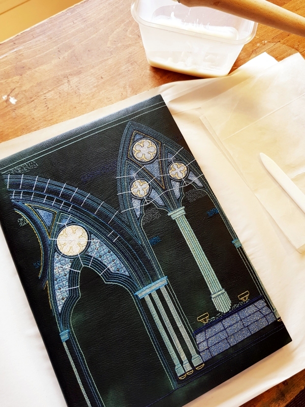
The original cover of the binding |
 |
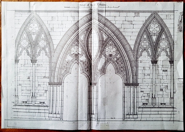 |
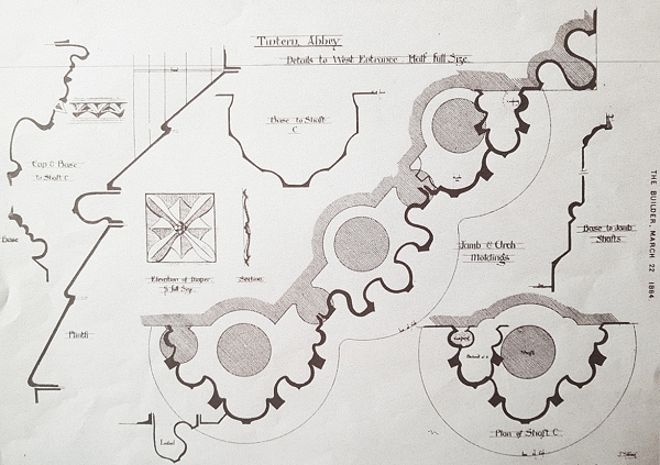
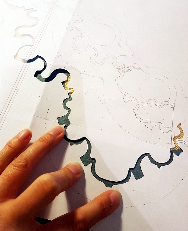
Although there is no mention of Tintern Abbey by name in the poem, the title of the book is very specific. The whole point of the poem is the location and the time, it tells the reader exactly where the speaker is and exactly when it was penned. The influence of this bit of nature 'a Few Miles above Tintern Abbey' had upon Wordsworth's development influenced the cover design I chose for the binding. I searched for plans of Tintern Abbey online and found some wonderful architectural drawings that were published on March 22nd 1884 in, The Builder. The Builder was a journal of architecture published in the UK in the 19th and 20th centuries. It began publication in 1843 and absorbed another journal titled Architecture. I chose to base my cover design on a plan I found of the 'Detail of West Entrance' |
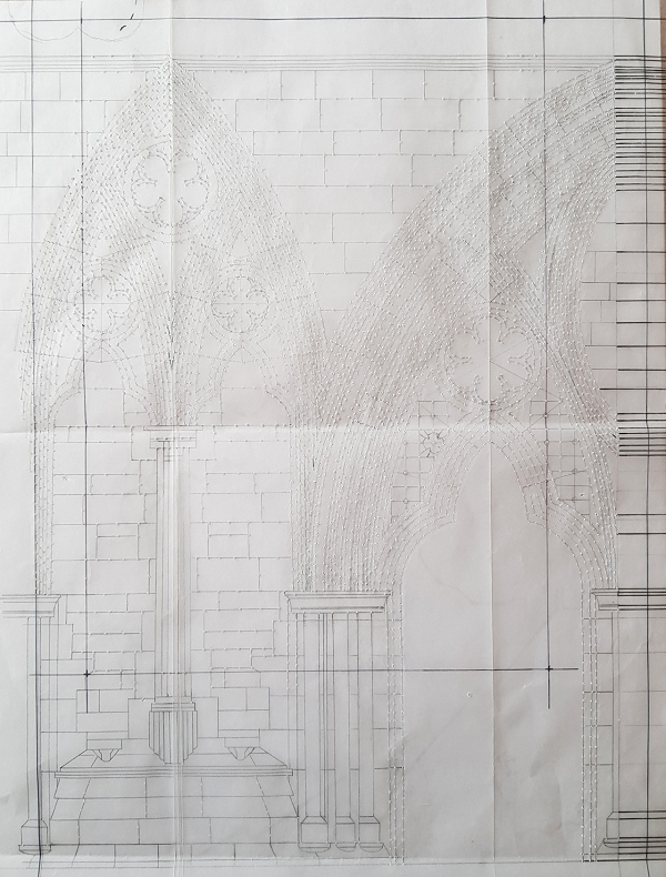
I decided to split this plan in half and tie the front and back covers together by using Lines (therefore directly relevant to the title of the book) to link across the spine. This design was then mapped out onto a piece of tracing paper to use as a master template for working on the covering leather. |
 |
 |
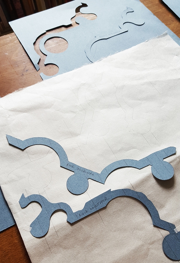
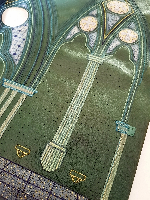
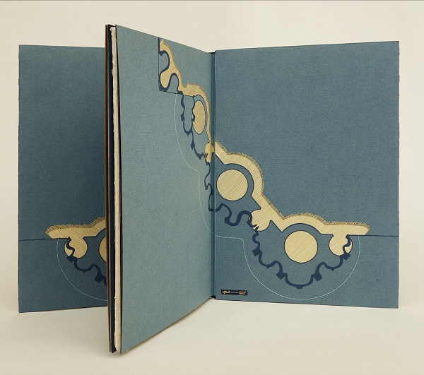
I then went on to depict the 'Jamb and Arch Moldings' from the West Entrance on the endpapers and doublures, the pattern of which was directly influenced by another drawing in the series from The Builder. |
I outlined the shape of this architectural detail onto my endpaper and doublure and cut out the shape with a scalpel. I designed it so that the pattern would run across the endpaper and onto the doublure, this was mirrored between the front and back covers. |
 |
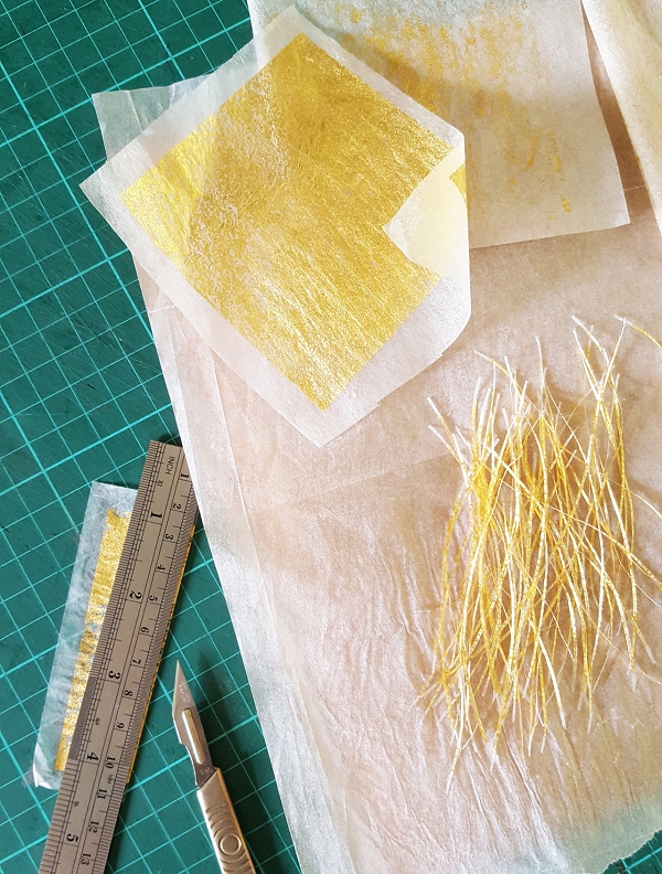 |
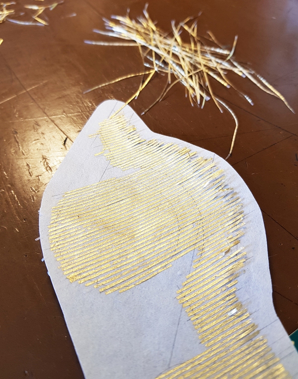
I wanted to fill in the 'void' with a striped effect, similar to the detail seen on the plan. At first I experimented with drawing lines with ink however I wasn't pleased with how it looked so instead turned my attention to using gold leaf. I adhered some gold leaf to very thin lens tissue (9gsm) using PVA glue. This was then cut into very small strips (around 1mm wide) with a scalpel. |
These thin strips were then glued to a piece of Japanese paper using fine pointed Tweezers to help position them into place. I had marked out the outline of where I need to fill with a pencil, plus added in some guidelines so that the strips remained straight across the whole expanse. |
 |
 |
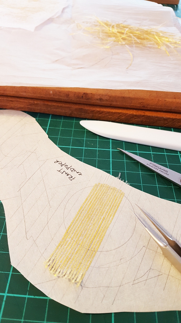
I left one end of each of the gold leaf strips unglued as I wanted them to lay on top of the blue doublure/endpaper paper once stuck in place, in order to avoid the look of a straight 'cut' line this end. These were individually stuck down at a later stage. |
The Japanese paper was stuck together with the blue paper and pressed. I used a paper template to position further cut paper detail on the surface and also to pierce through and mark points for a small amount of embroidered detail.
|
 |
 |
The paper for the endpapers was laminated to a gold effect handmade paper. I made sure that the embroidery I did on the endpapers was really neatly tied down on the reverse as I knew when these papers were laminated together the threads would be visible. |
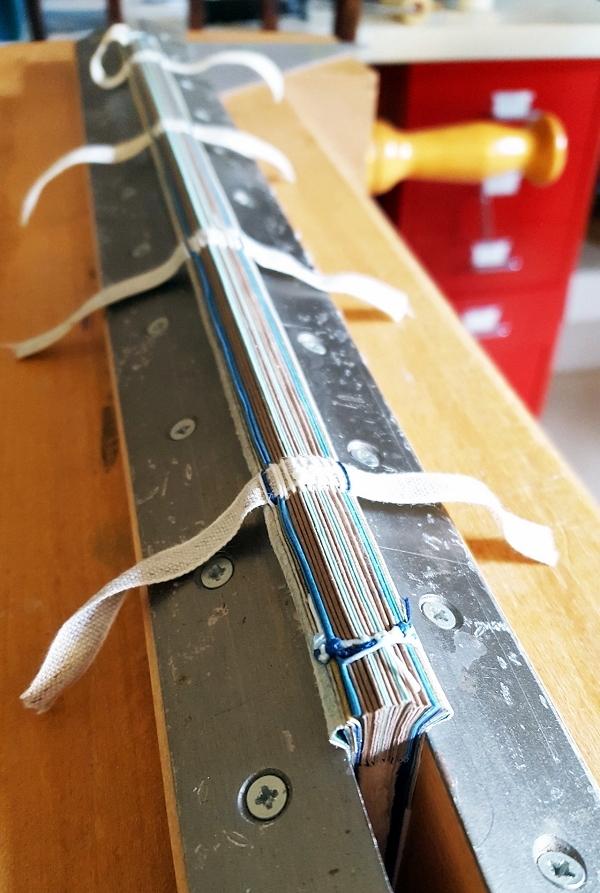
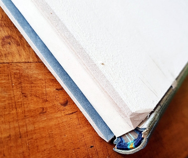
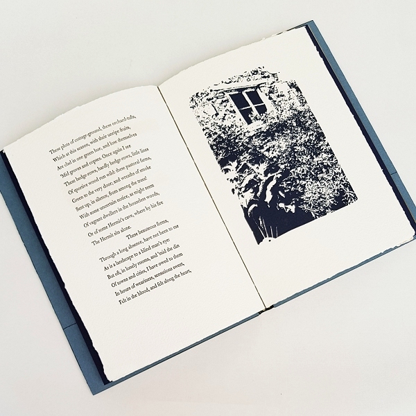
The text block was only three sections and was made from thick handmade paper. The paper was an important part of the making process for the book itself as an excerpt from the Old Stile Press website explains: 'To begin, therefore, with the paper. Of a purity so important to the process, 'the waters' taken and used by Frances were indeed 'rolling from their mountain-springs with a soft inland murmur', as they pass our house on their way to the Wye itself. Also the inclusions (Reed &c.) that give such character to the endpapers and the cover were all picked 'on the banks of this delightful stream'. I chose to bind this book using stubs as this was a good solution to dealing with the thick sections. I worked out the number of stubs I needed for the thickness of the book and sewed the book up onto four tapes. The endpapers were made to the full width of the book so no stubs were needed for them. The text block was rounded and backed and the endbands were sewn. The spine was first lined with some Aerolinen and then a strip of goatskin which was stuck to the spine, skin side down. This was sanded flush and a two-off one-on hollow was attached. |
 |
 |
The boards were laced on and back-cornered and the edges of the boards were all sanded to a long bevel. |
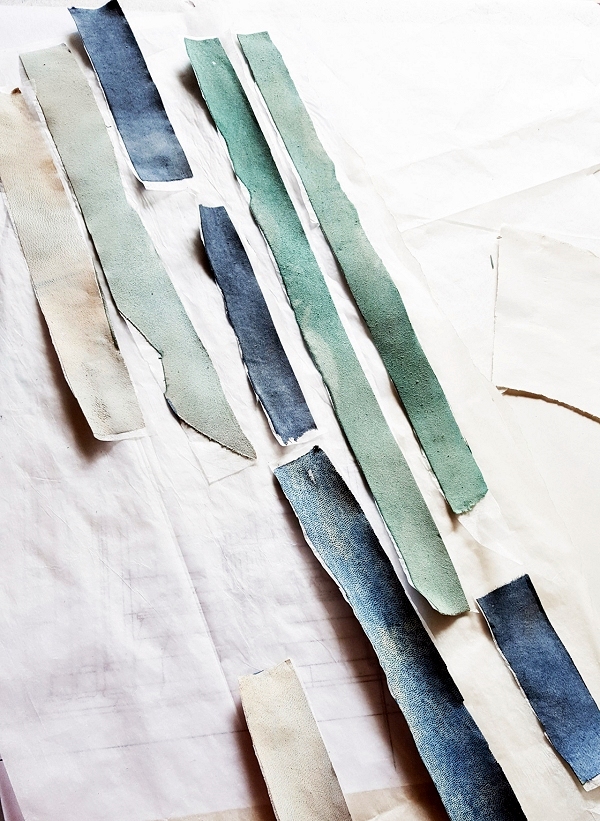
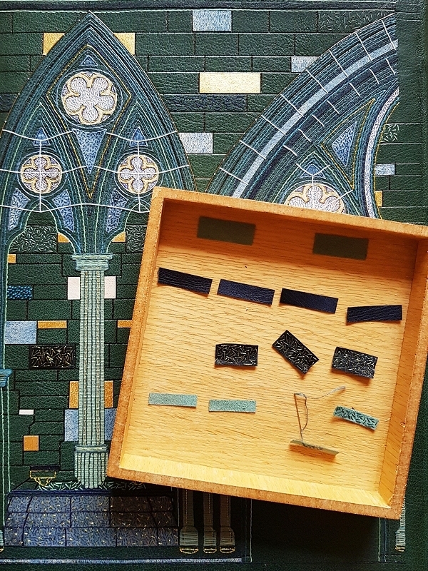
At this point I was able to accurately measure the exact size of the leather and therefore the outer edge of the design. I used strips of suede that I had edge-pared from the back of miscellaneous skins using my Brockman paring machine. I don't throw any of these away as I have discovered they work really well as onlays. I like the colour variation they provide and when backed to lens tissue this stabilises them well. |
 |
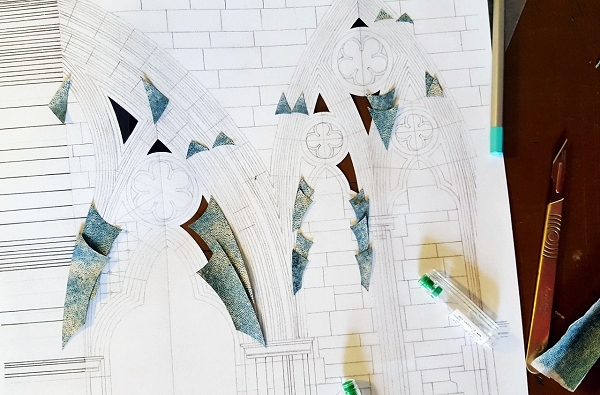 |
In particular for this design the suede onlays gave a great mottled look, in my mind mimicking the look of stained glass. They were stuck down to the covering leather through a template using PVA glue. |
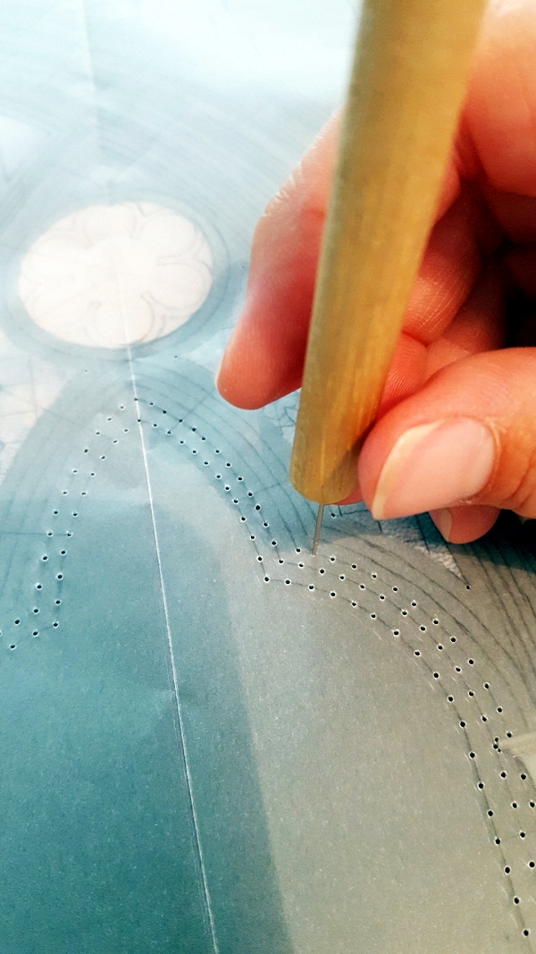
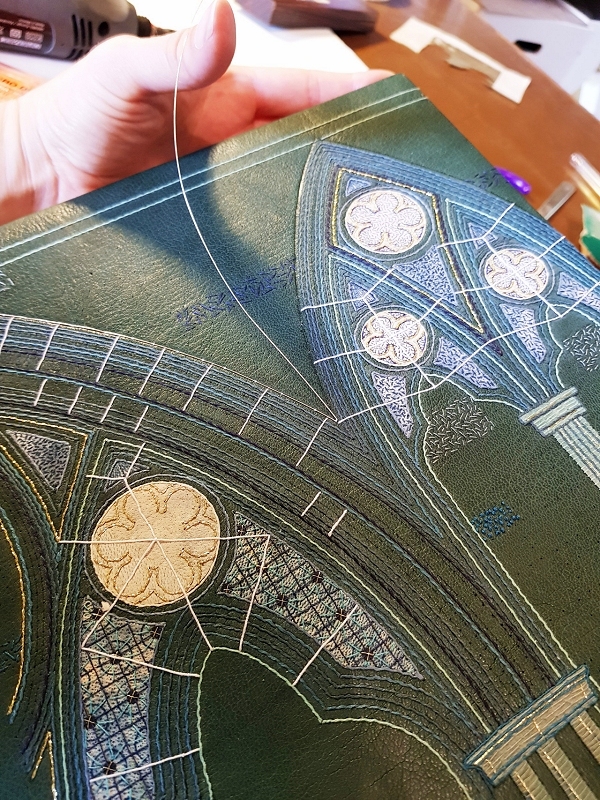
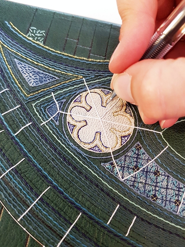
Once the onlays were stuck in place they were back-pared. I was then able to get on with the embroidery process. Initially I used the tracing paper template to prick holes through with my needle pricker to mark out the lines I needed to embroider. |
 |
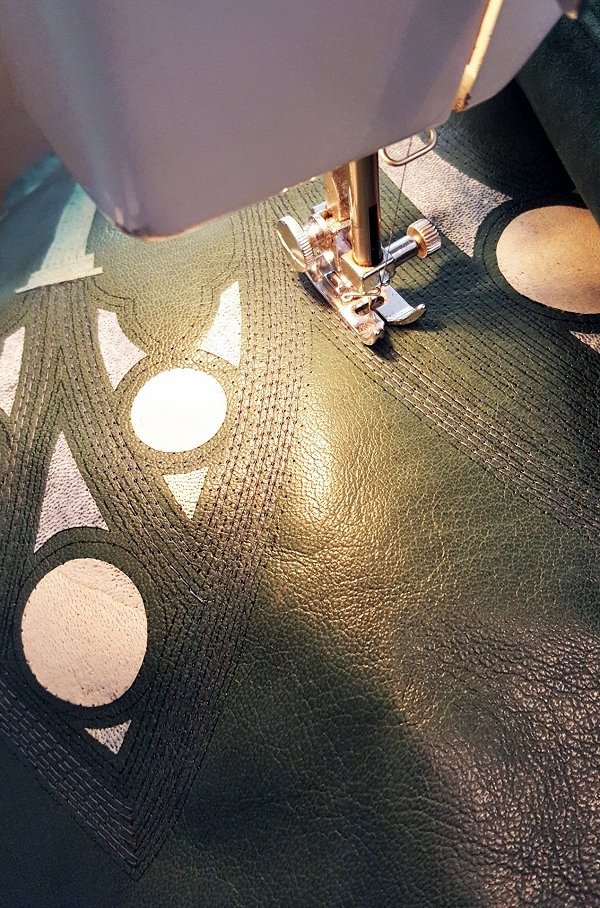 |
Given the multitude of embroidered lines making up this design I did the initial linear work using my sewing machine to speed up the process. |
Once these guide lines were in place I 'whipped' around each of these with threads of differing colours to add definition and colour variation. |
 |
 |
 |
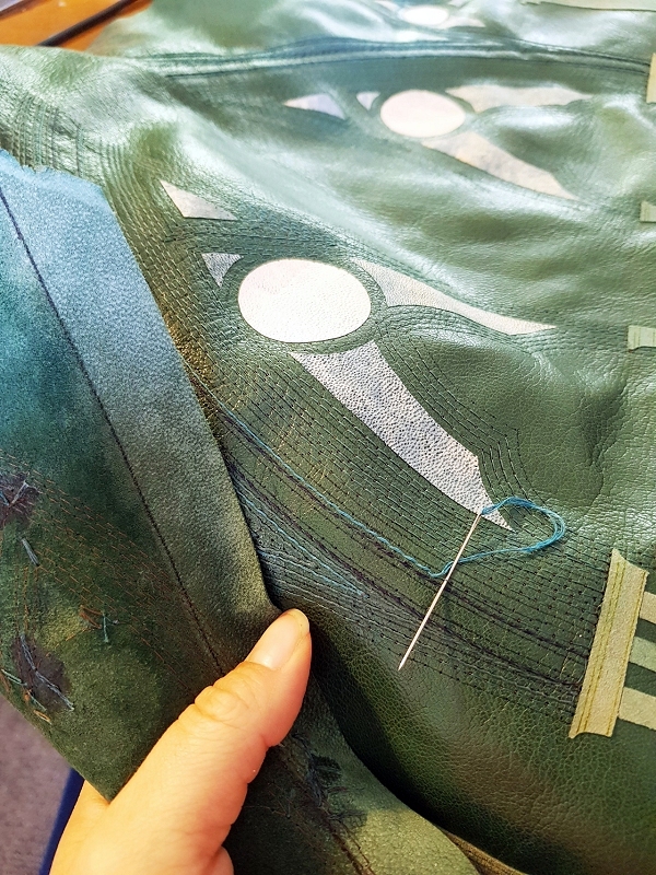
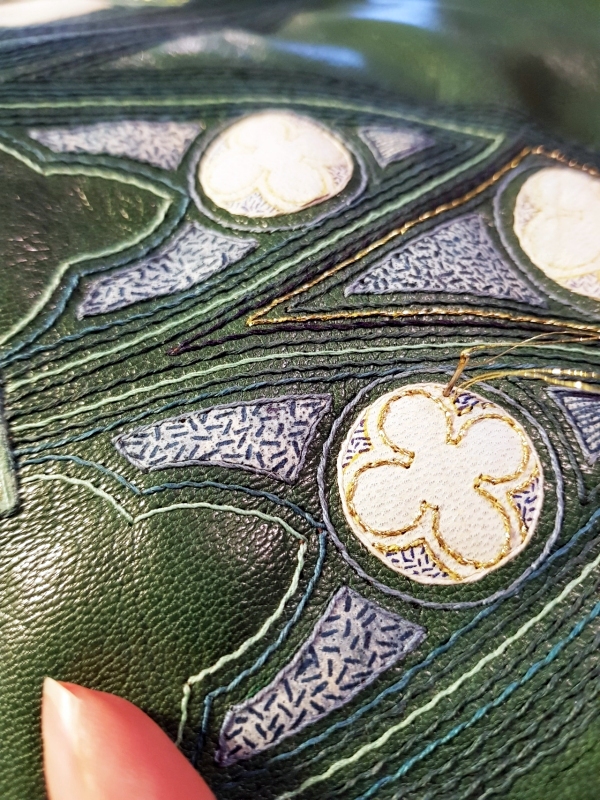
Further embroidered detail was added using cotton and metallic threads. |
|
I also added extra detail to the surface of some of the suede onlays using a fine-nibbed pen.
|
 |
 |
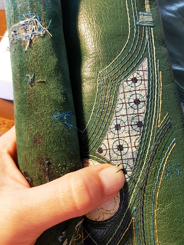
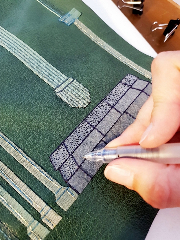
Once all of the embroidery was done I marked out where the brickwork was going to be by pricking around the outlines through the template. I was able to add some sewn detail onto some of the bricks at this point before the leather was glued onto the book.
|
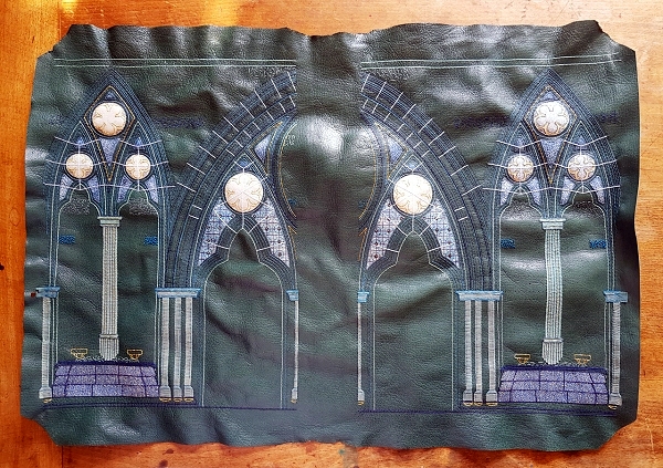
Once all of the embroidery was complete the front of the leather looked like this
|
 |
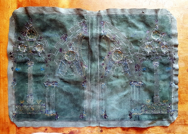 |
And the back like this
|
It was then time to stick the leather to the book - always the bit I find most daunting after spending so many hours working on it before it goes onto the book! I dampened the front of the leather using a water atomiser. Once damp I turned the leather over and applied paste. I did three applications of paste to make sure that it had absorbed well into the leather.
Once the leather was on and the headcaps had been formed I left the book to dry under a light weight for 24 hours changing the blotting papers regularly. |
 |
 |
Once completely dry I applied a run of water to the spine joints using a water pen to dampen the leather at this point before attempting to open the covers. The covers were opened and the text block, along with the leather joints, were released from the paper and cling film wrapper that was keeping them away from the moisture created during the covering process. The leather joints could then be stuck down in position.
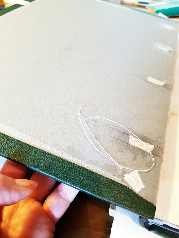
I had bought some gold wire that I wanted to attach to the boards on the topmost line of the abbey design. I blind-tooled a groove into the leather at this point using a gouge with the correct curve. |
Small holes were drilled right through the board using my Dremel and a very tiny drill bit. I used these holes to anchor the wire to the front of the board using a thread.
|
 |
 |
The thread moved up from the back of the board, over the wire, and then back through to the back of the board to hold the wire in place.
|
Once the wire had been sewn on through the boards, the boards were infilled with watercolour paper. An additional layer of Zerkall paper was glued down and sanded to level out any bumps and then the finished paper doublure was glued down in place. Final pen detail was added to the onlays at this point.
|
 |
 |
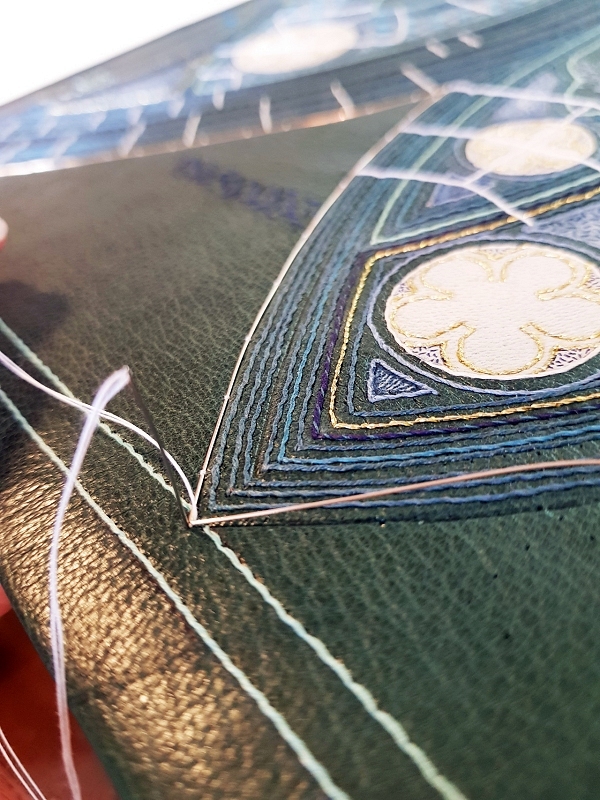
I then spent time working on the bricks. I scored lines into the surface of the leather using a fine bone folder and a T-square in order to get them even and regular. These brick outlines were then marked in using ink to build up the pattern. The lines were also run across from the front cover design to the back to link both together.
I used variety of methods to illustrate the bricks; gold leaf stuck to leather (using glaire and heat to fix it in place), embroidery (French knots and stem stitch), suede onlays, leather onlays and blind tooling. |
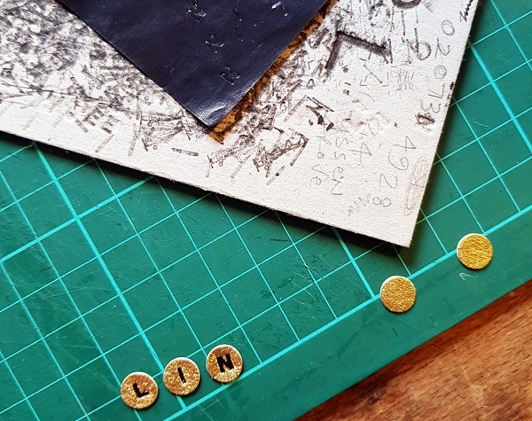
I wanted to add a title to the spine so punched circles out of the gold leaf-faced leather. This was then carbon tooled with the book title and stuck to the book spine.
|
 |
 |
Finally the book was blind tooled to add a decorative look to the book as a whole.
|
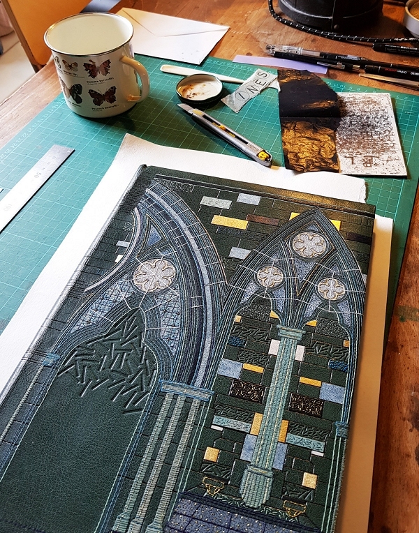
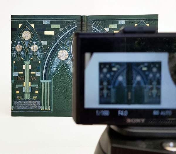
Once the book was complete it was time to photograph it in all of it's glory!
|
 |
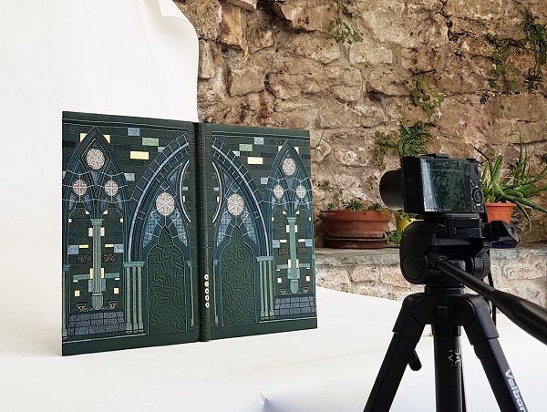 |
I now do all of the photography of my bindings myself, and thankfully have a wonderfully light conservatory in my house in which to take these photos. Later this week you will be able to see more images of the book on my website here.
|
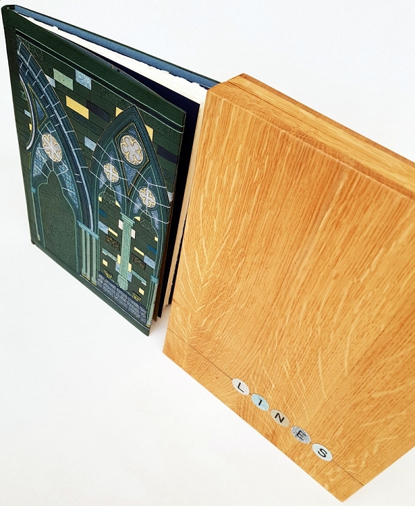
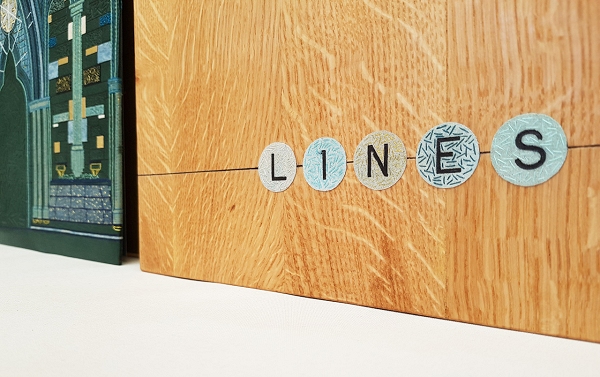
The book was housed in an oak box, with a simple 'line' and title on the lid which was tooled on coloured suedes and embroidered to match the book cover.
|
 |
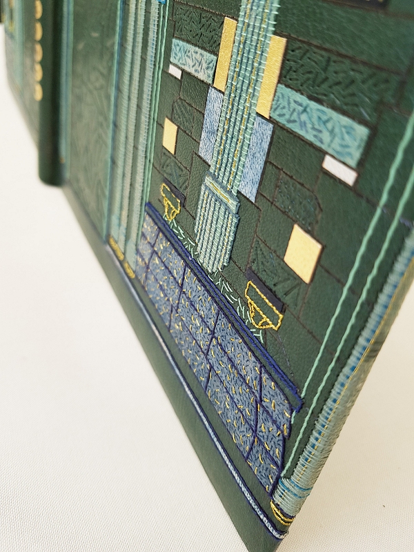 |
A detail shot of the front cover.
|
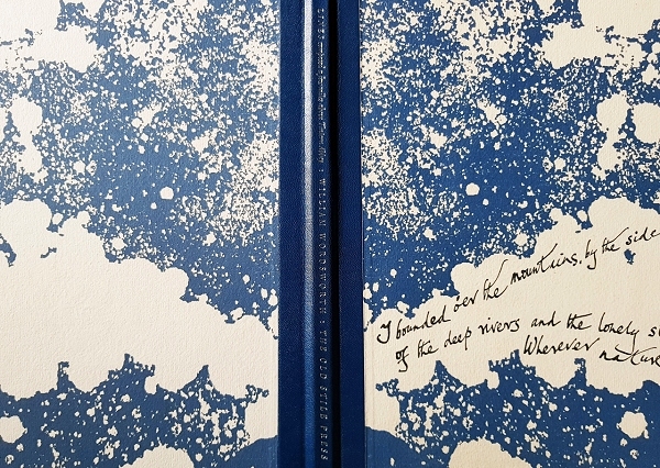
The endpapers and doublures
|
 |
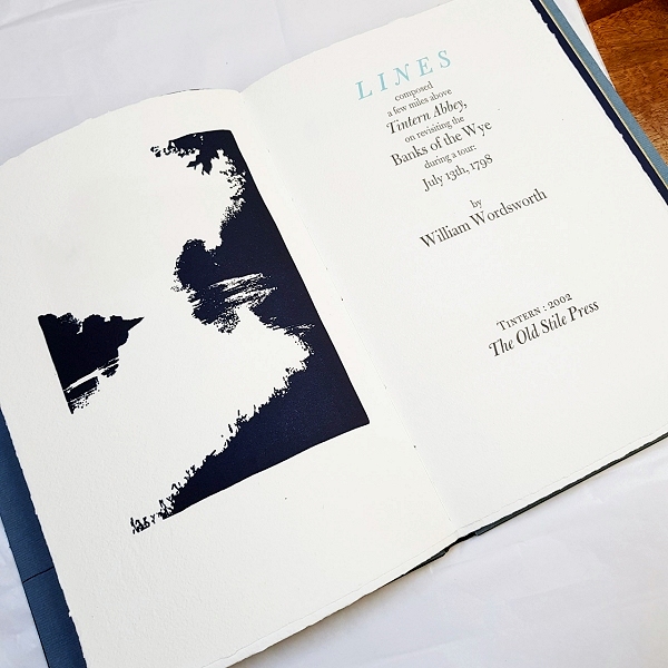 |
The title page
|
And in conclusion, an excerpt from the tail end of the book, penned by Nicolas McDowall:
|
 |
Hannah Brown - Is a self-employed bookbinder working from her home studio in Somerset. She works to commission creating unique bindings on books using a variety of skills including: leather work, embroidery, metalwork and carpentry, and enjoys writing about her projects on Han-made bookbinding - han-made-bookbinding.tumblr.com
Skin Deep - Volume 50 - Autumn 2020
Download Skin Deep - Volume 50 in PDF Format